

Skills Employed
Custom WordPress design / development
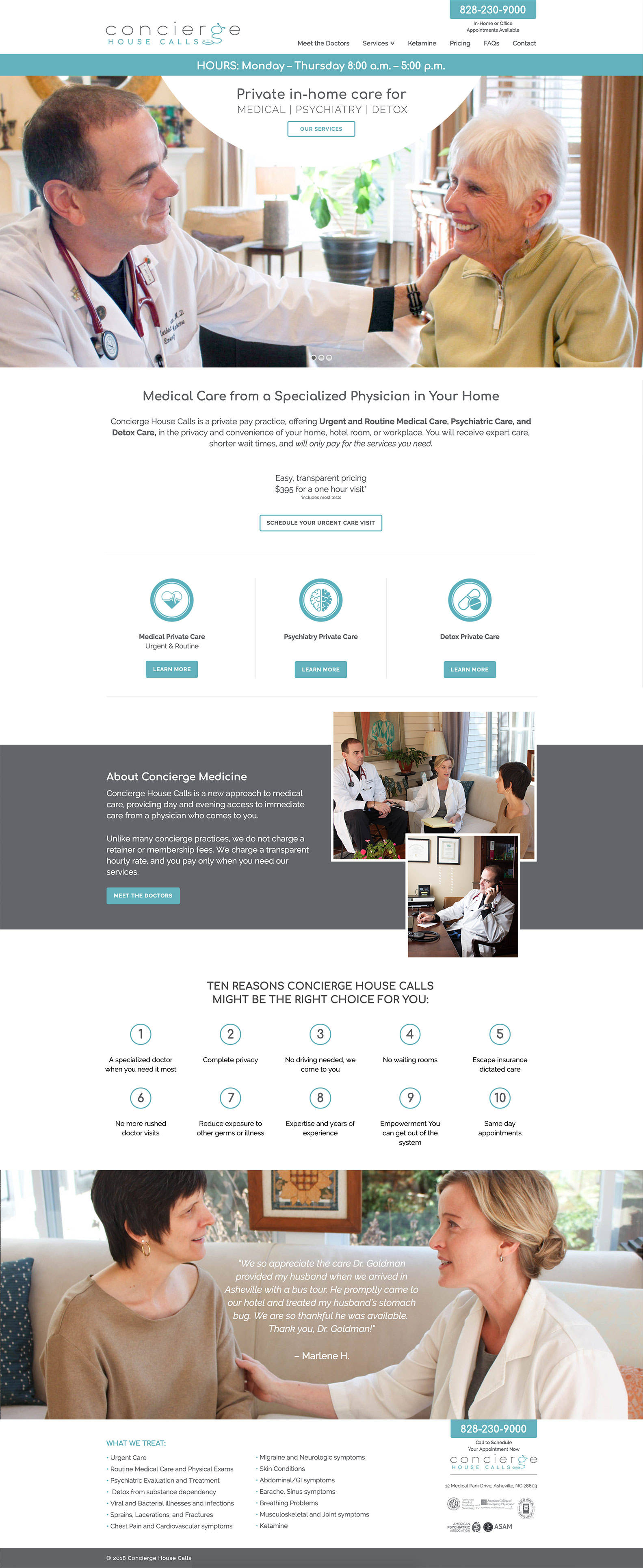
Clean and easy to navigate website
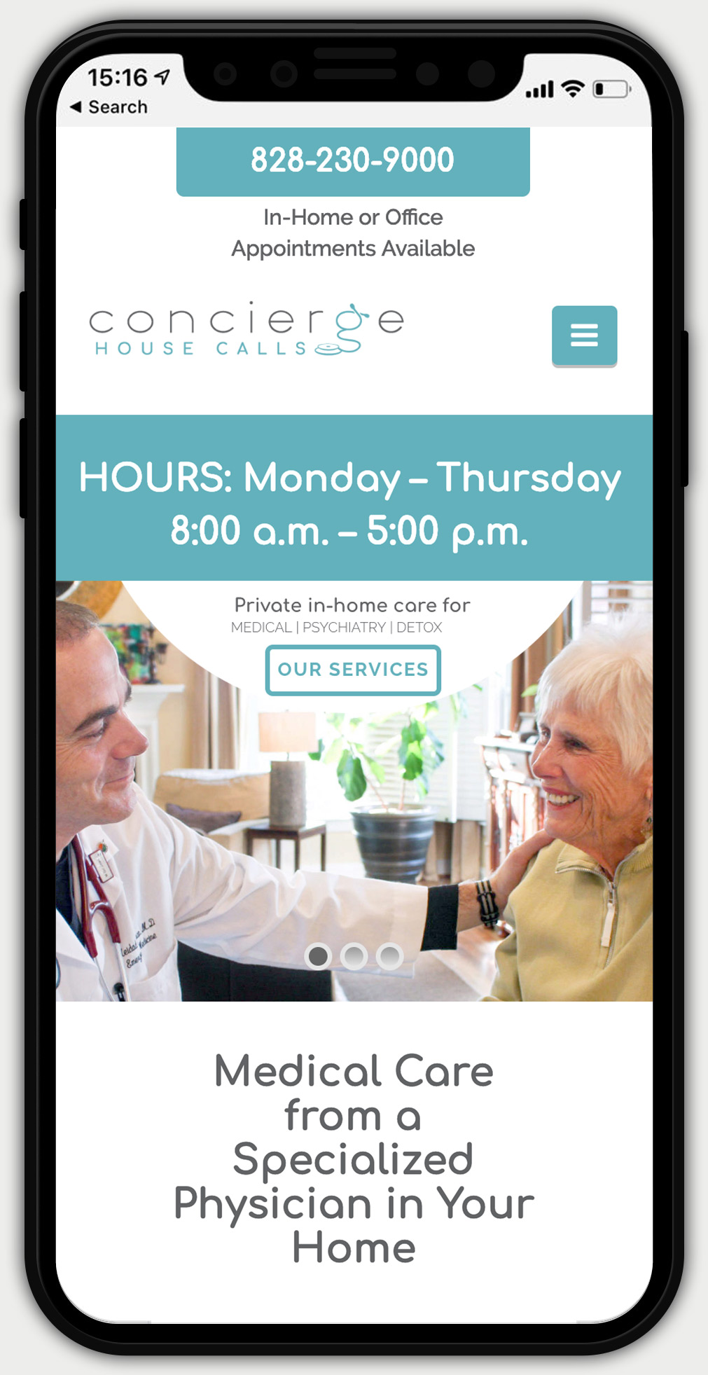
Large text for elderly clientele
Easy to find contact information
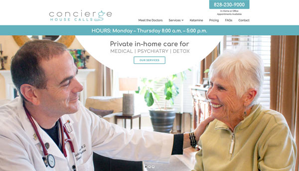
Responsive / mobile friendly
More Info
Dr. Goldman needed a website that his clients could easily read and navigate. His contact info and hours were most important to be visible on a phone. With this information, we created an incredibly clean and sleek user experience for all ages, even those who aren't tech savvy. The light colors combined with a clean sans serif font help give a light and uplifting feel to the overall website.


